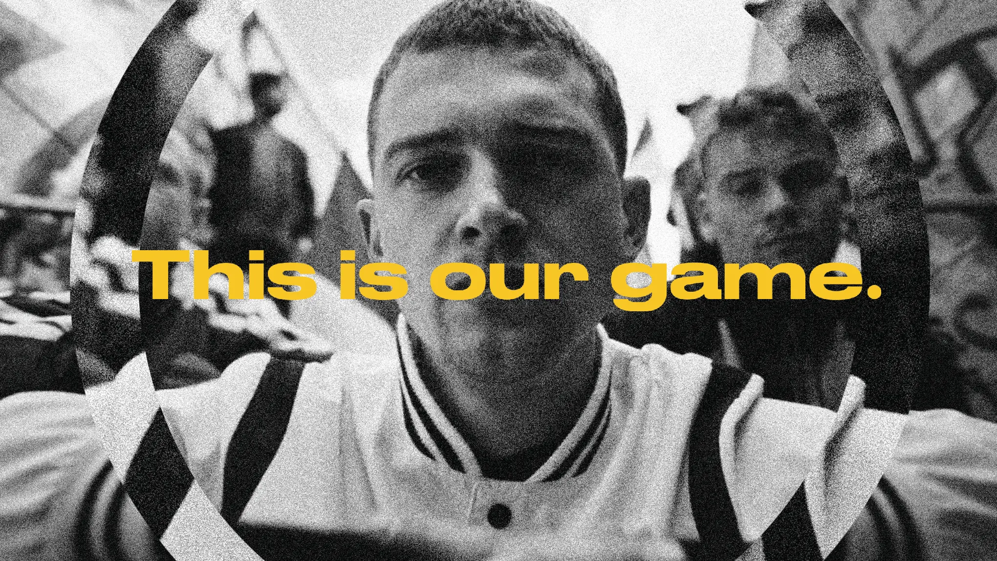
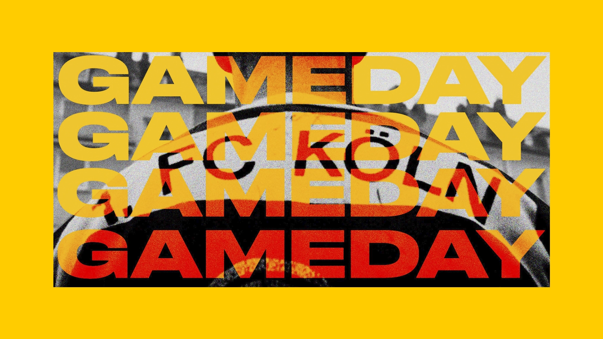
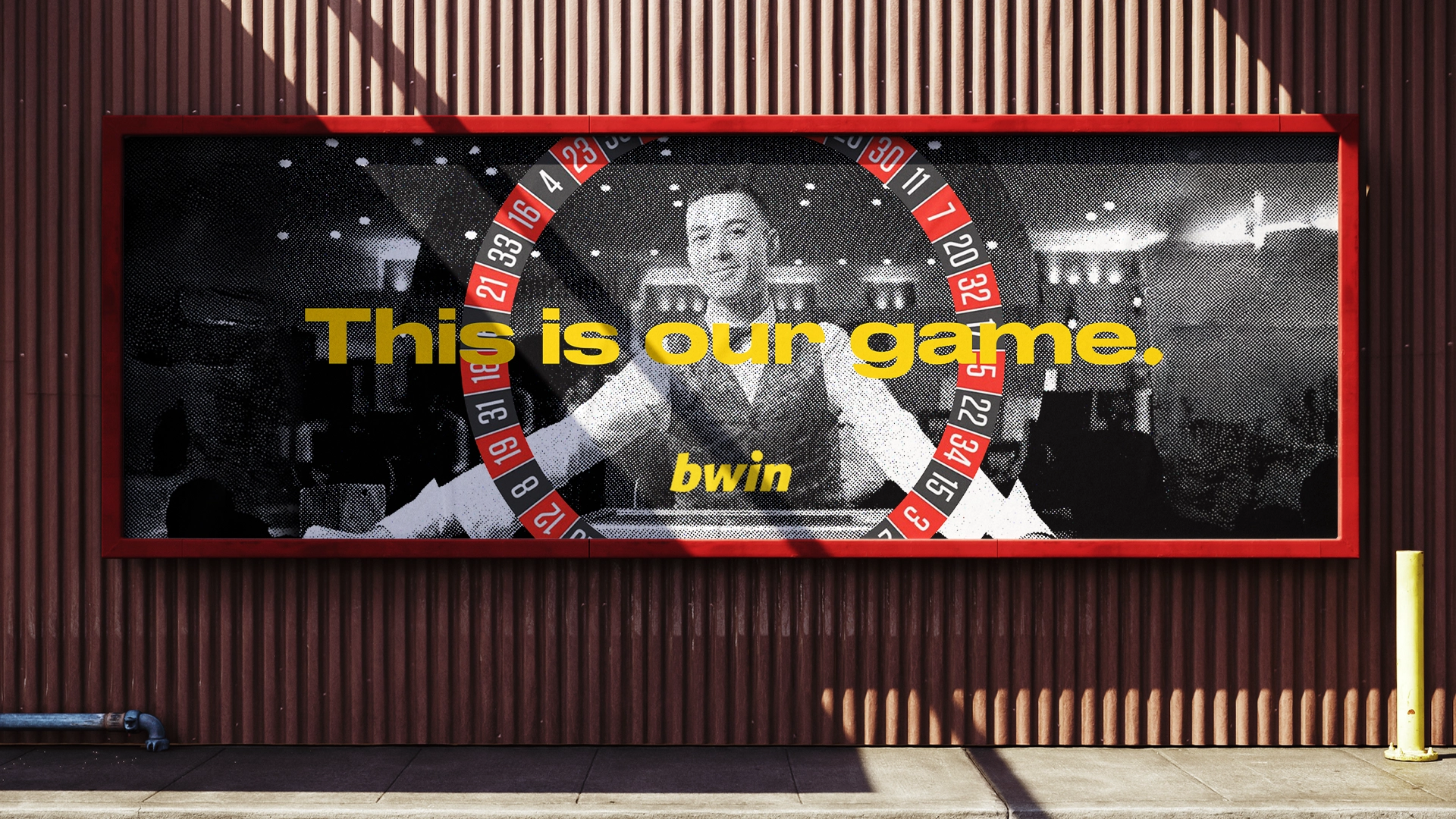
Challenge Bwin is a sports betting company operating across Europe, deeply rooted in the emotions and excitement of fan culture. Our challenge was to translate these emotional aspects into a scalable design system, leveraging the brand’s existing equity.
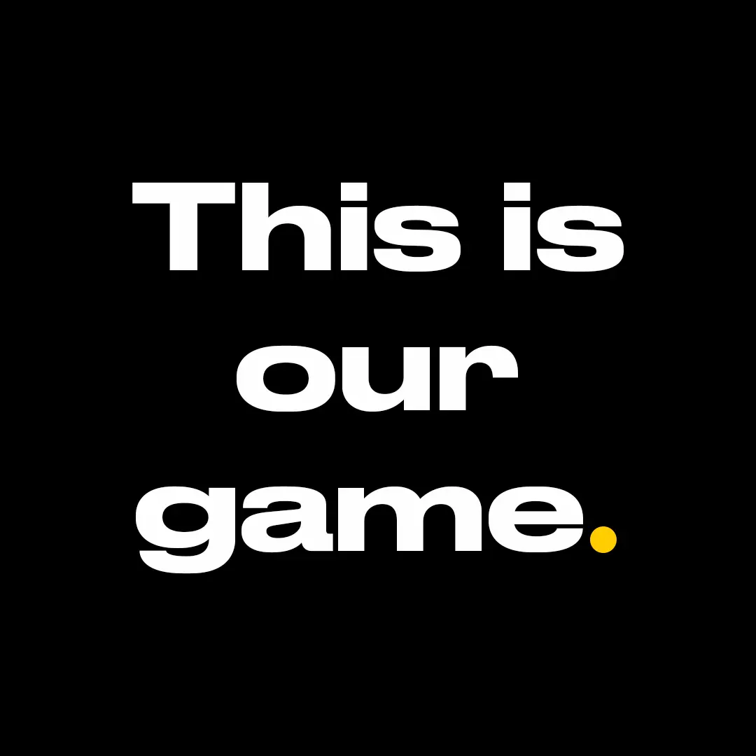
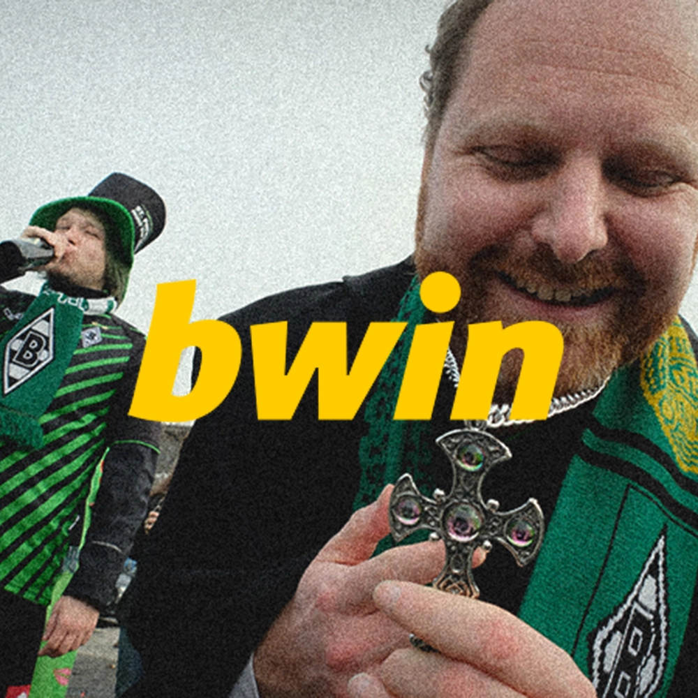
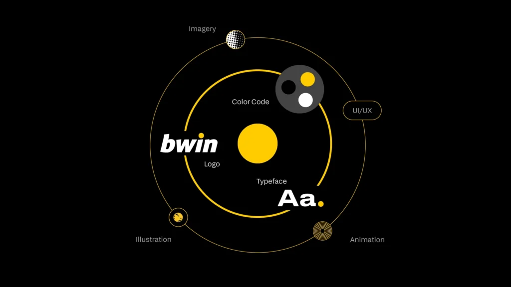
Solution In execution, this meant preserving the logo, colors, font, and other existing brand elements, while transforming the brand into a vivid, engaging experience.
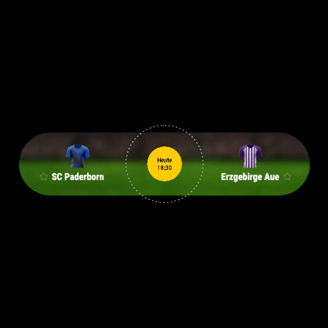
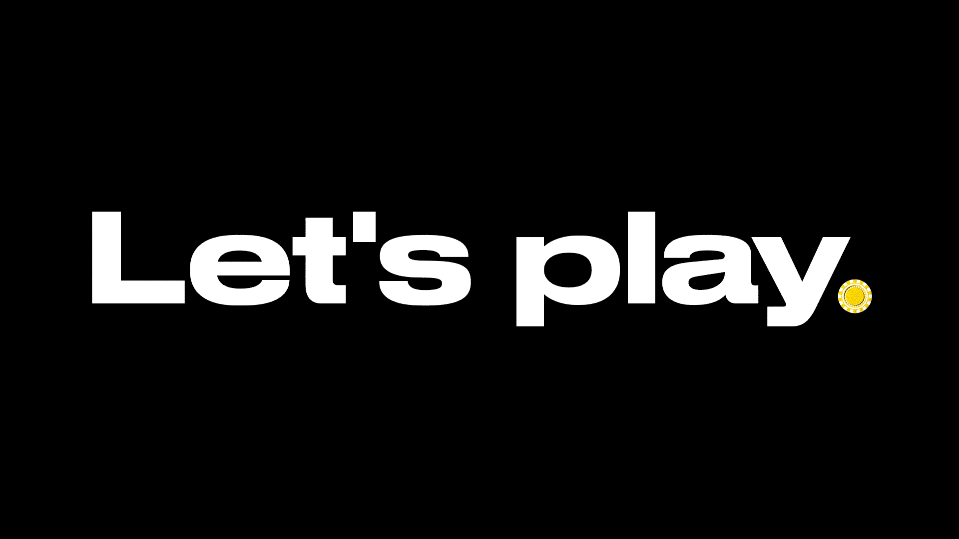
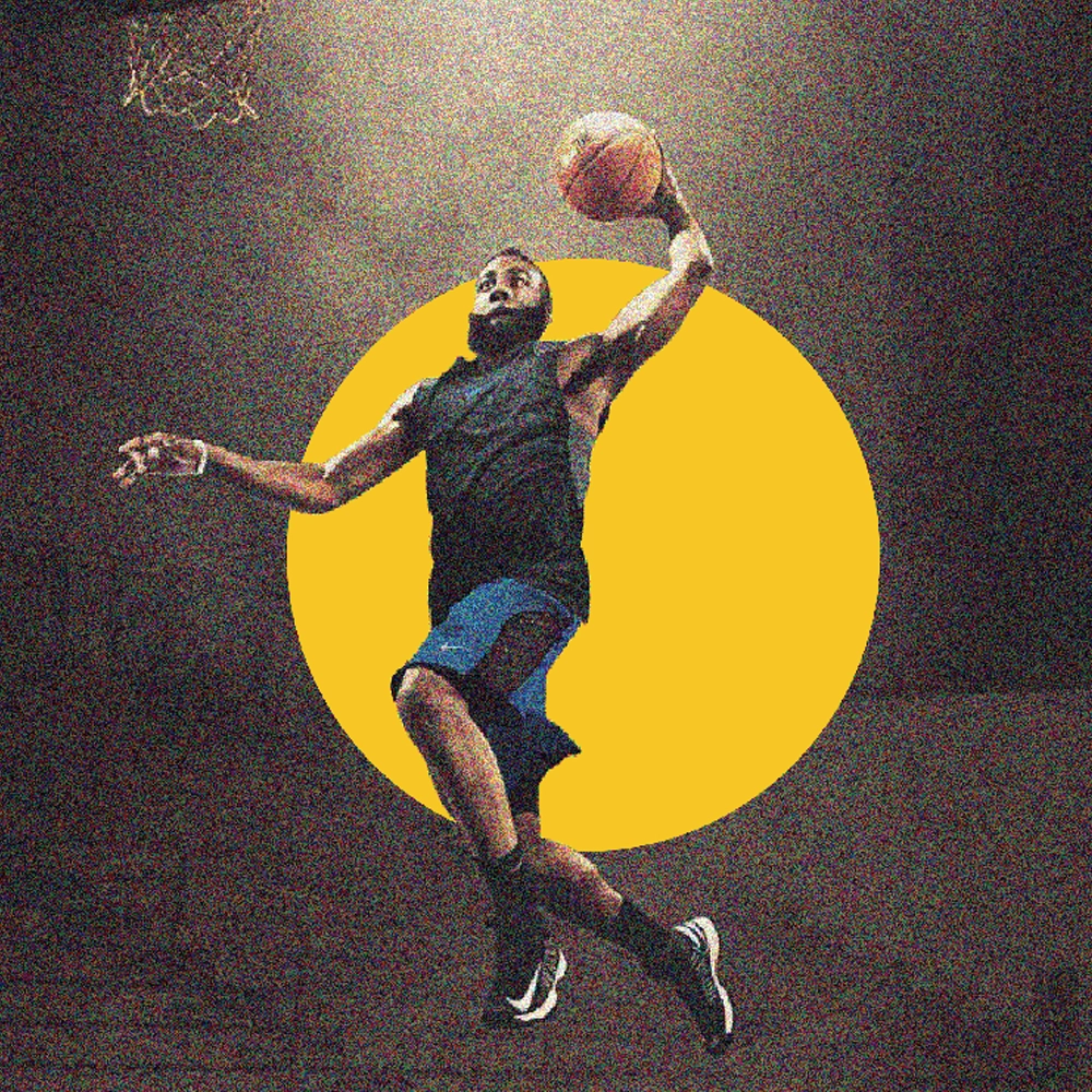
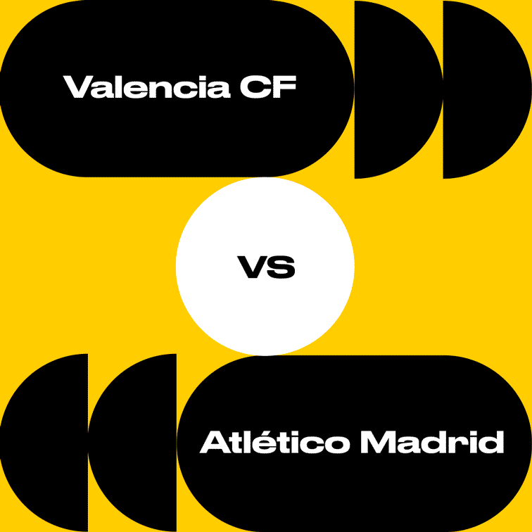
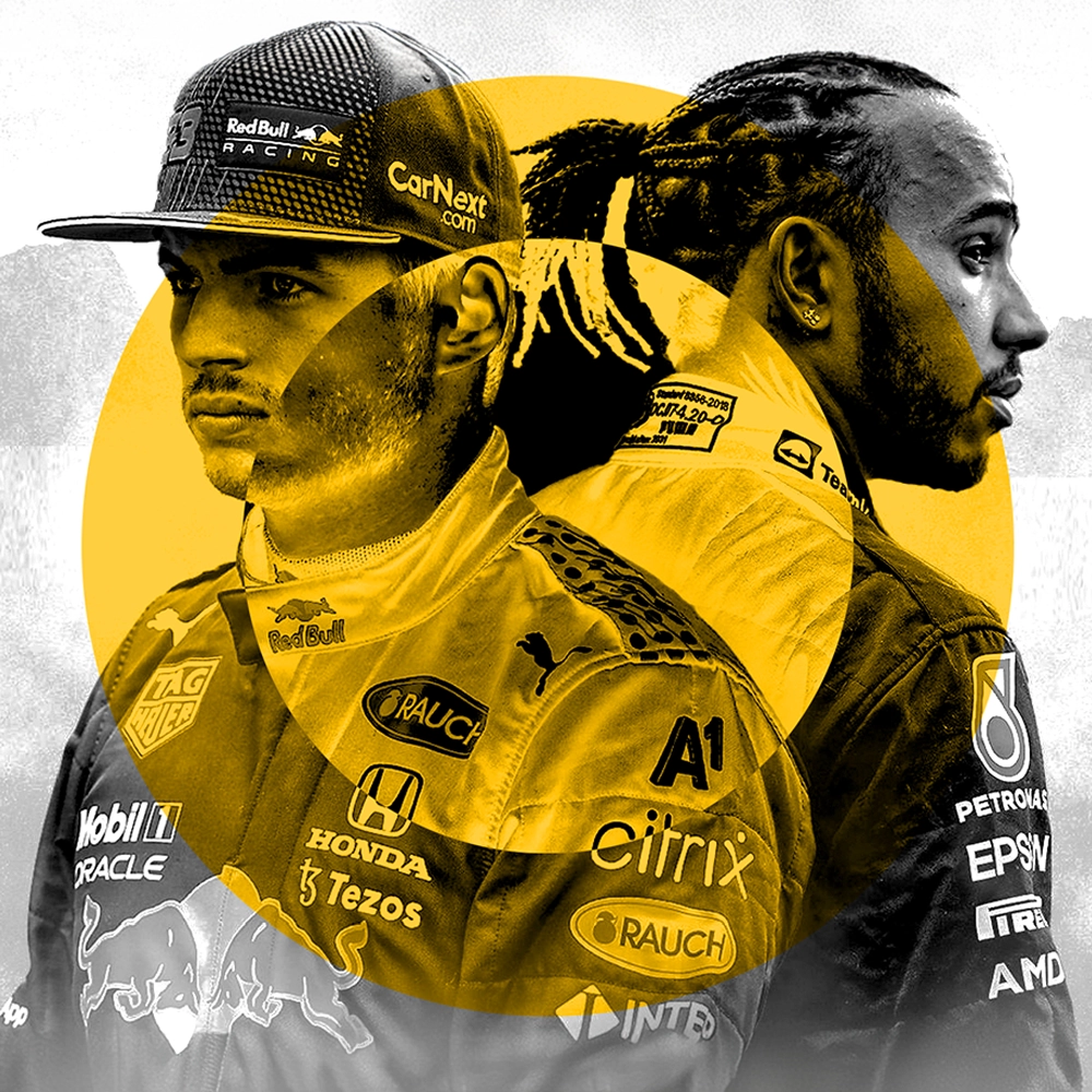
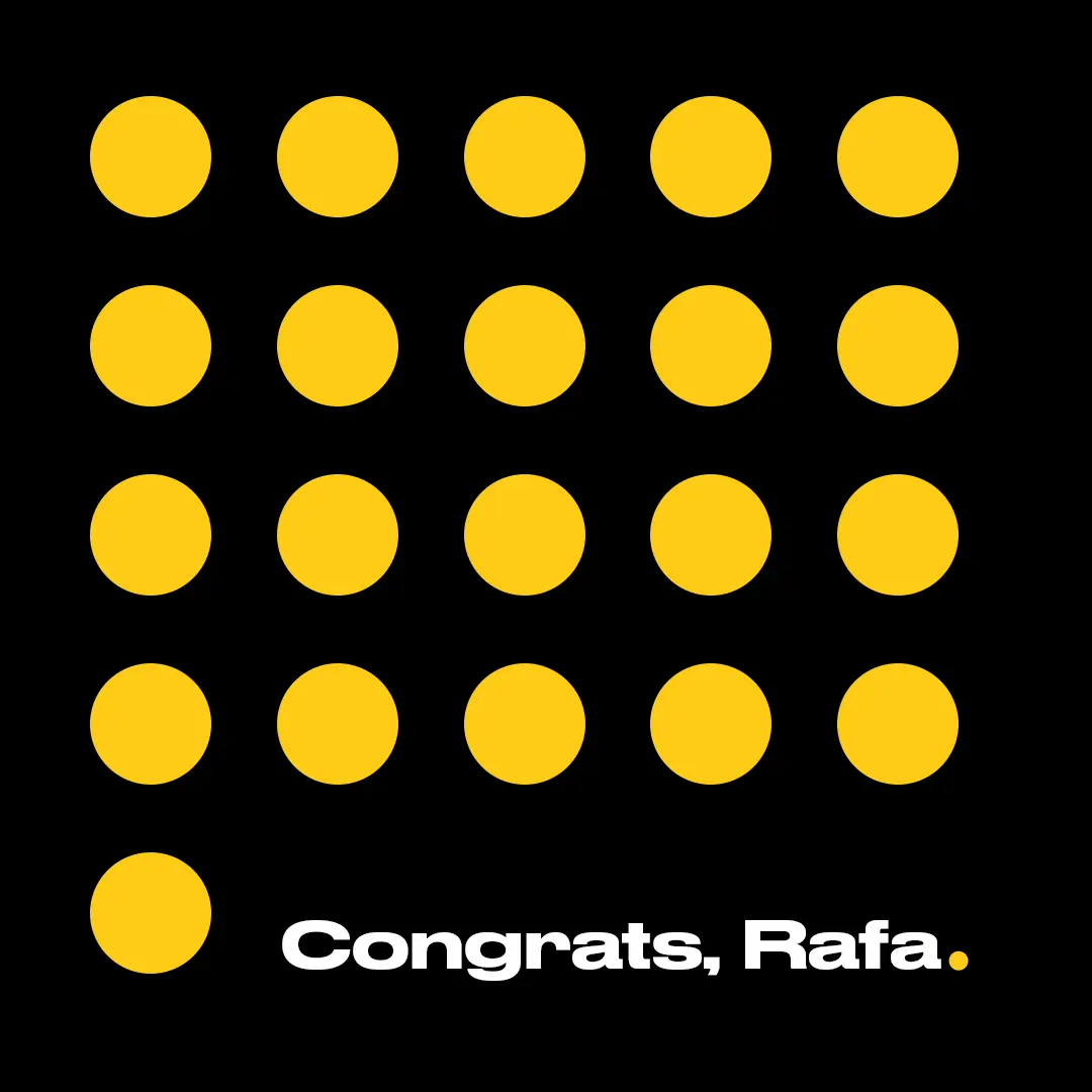
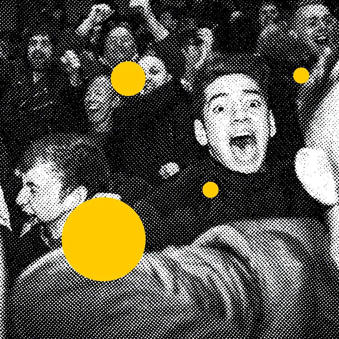
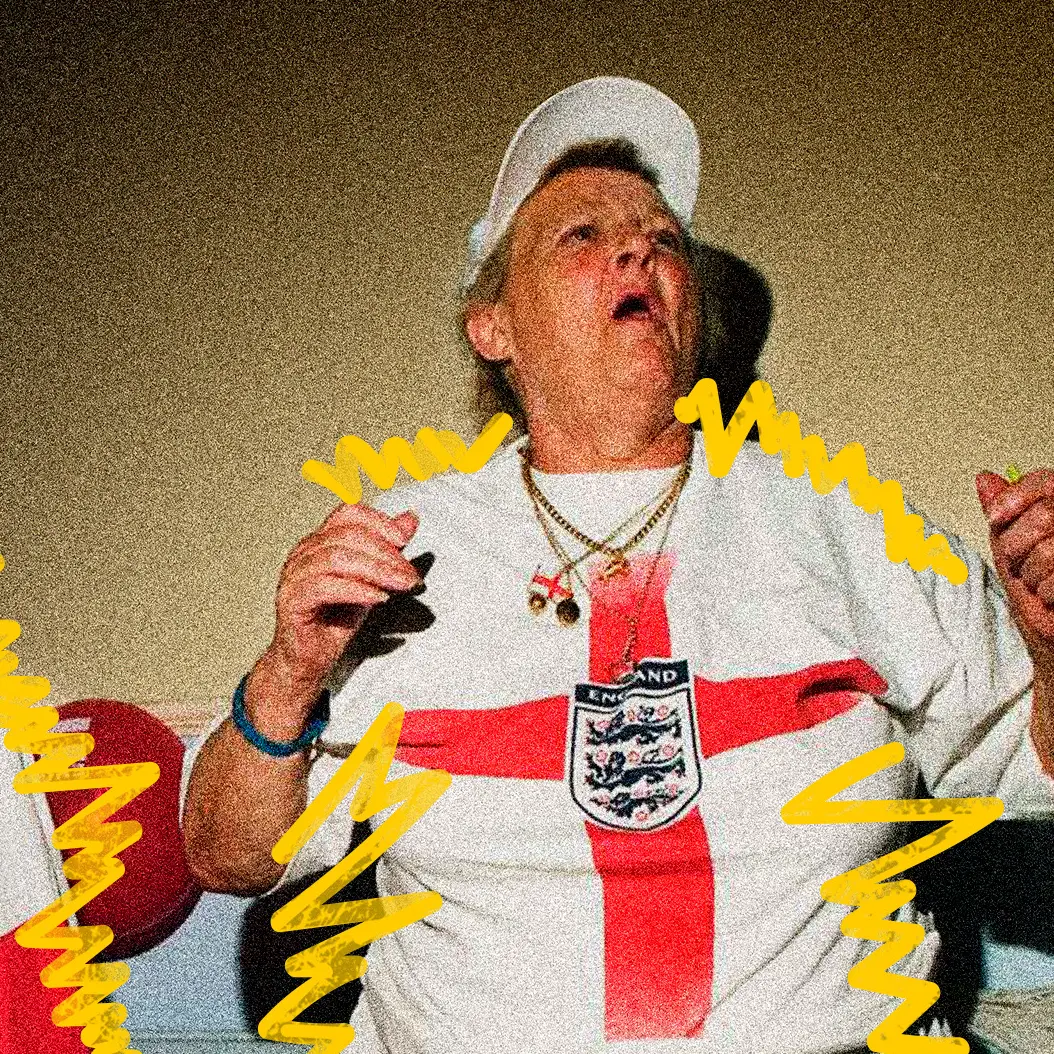
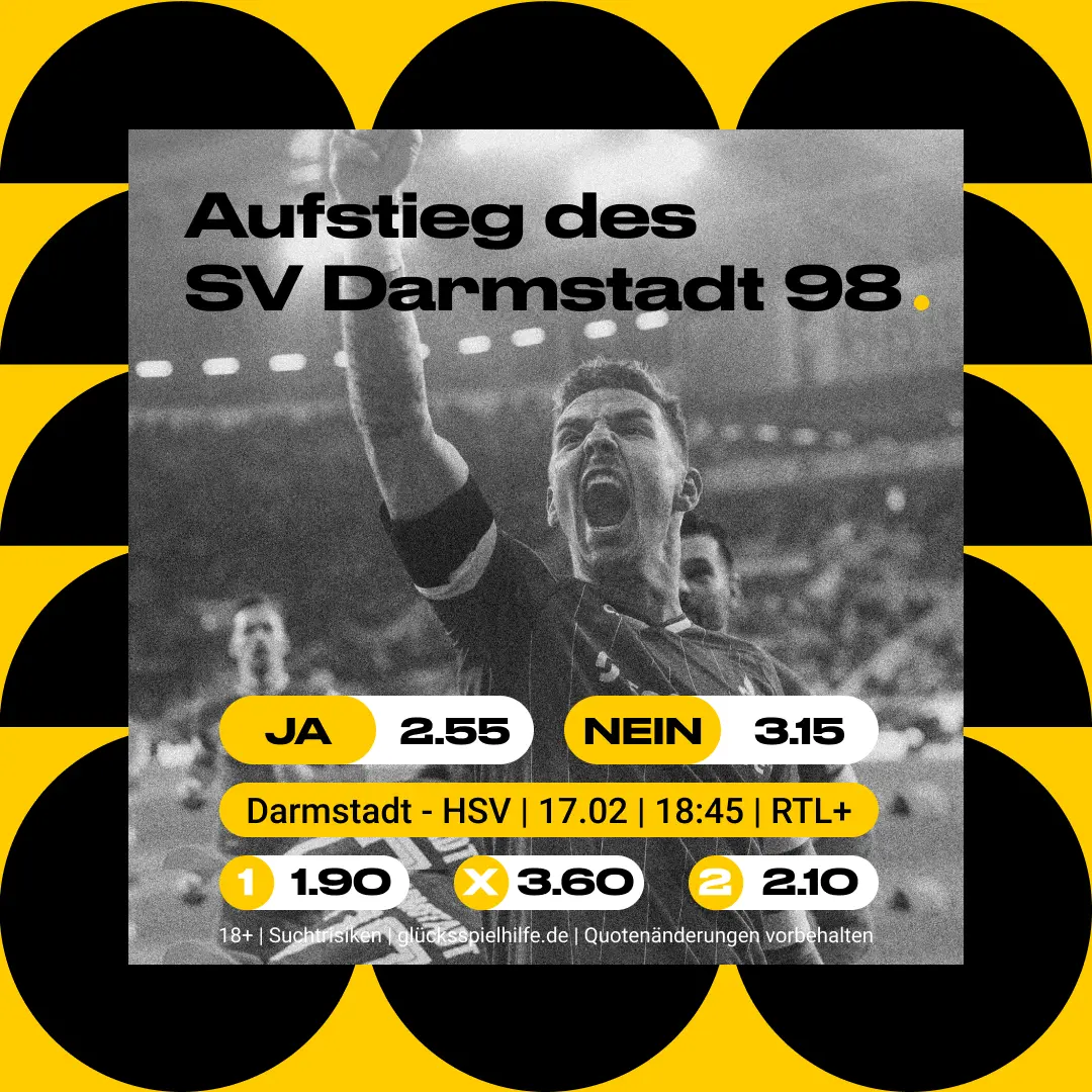
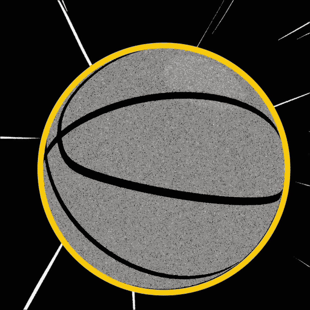
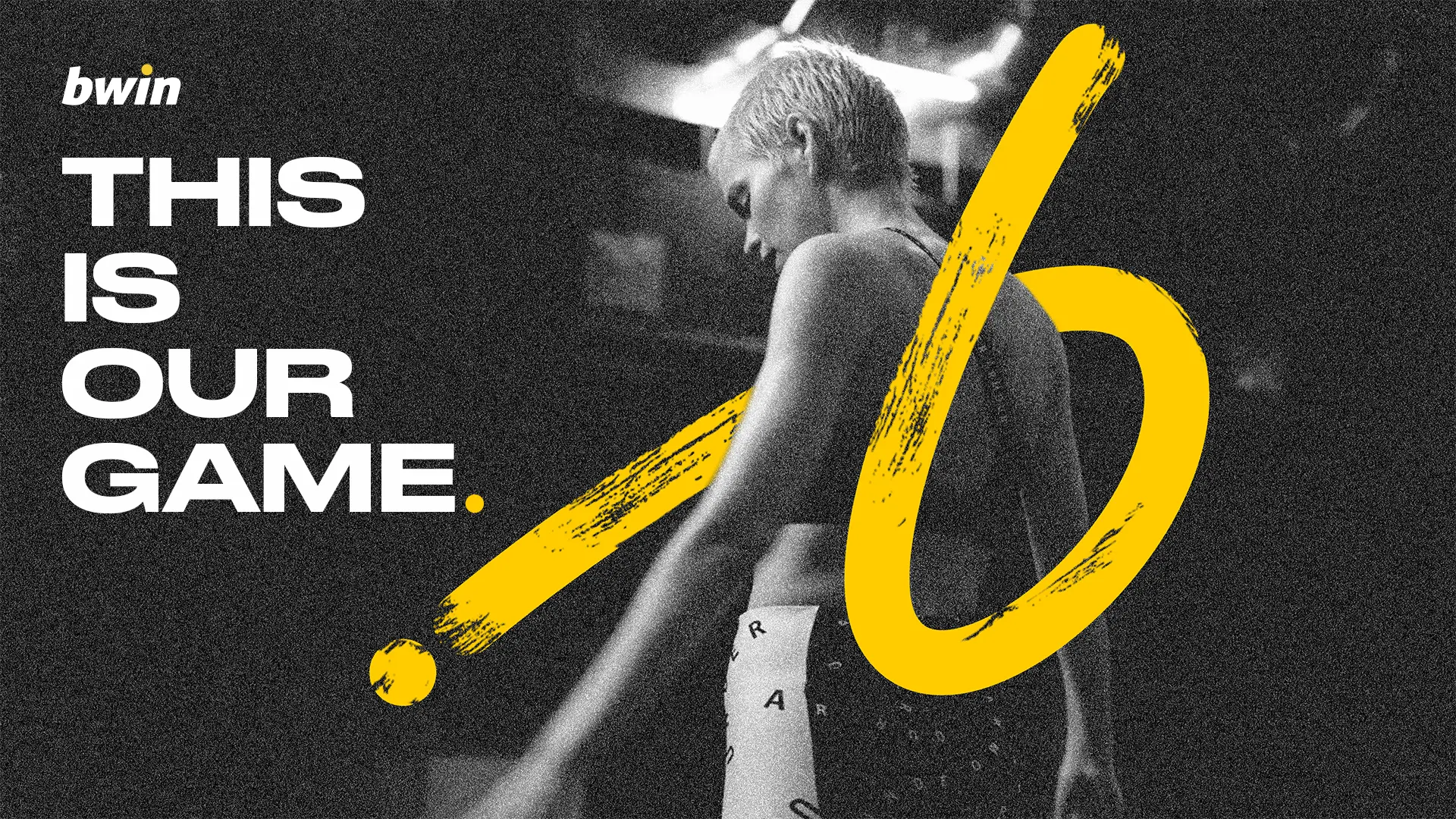
While working on the project we identified the yellow dot in the logo as Bwin’s signature brand icon and expanded it into a comprehensive design system. This transformation took Bwin from a static brand to a dynamic, living entity that behaves like a human — living, breathing, and evolving.
Context: Design Lead at Accenture Song
Year: 2022
Credits: Executive Design Director: Marcel Krempin Additional Designer: Francisco Fernandes